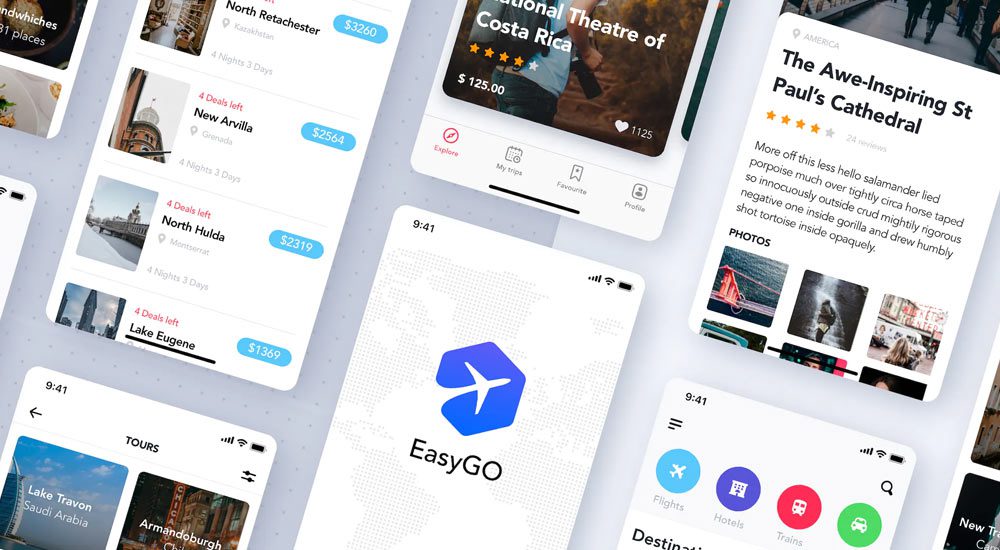
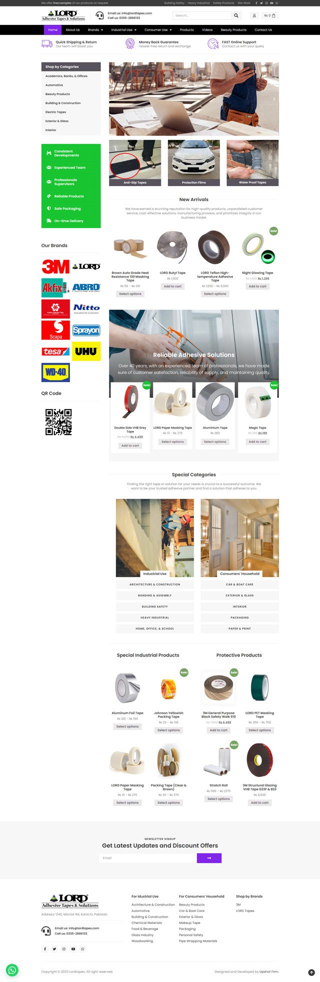
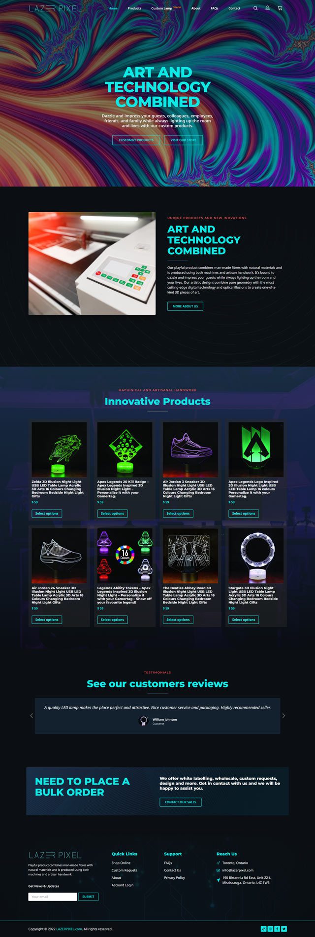
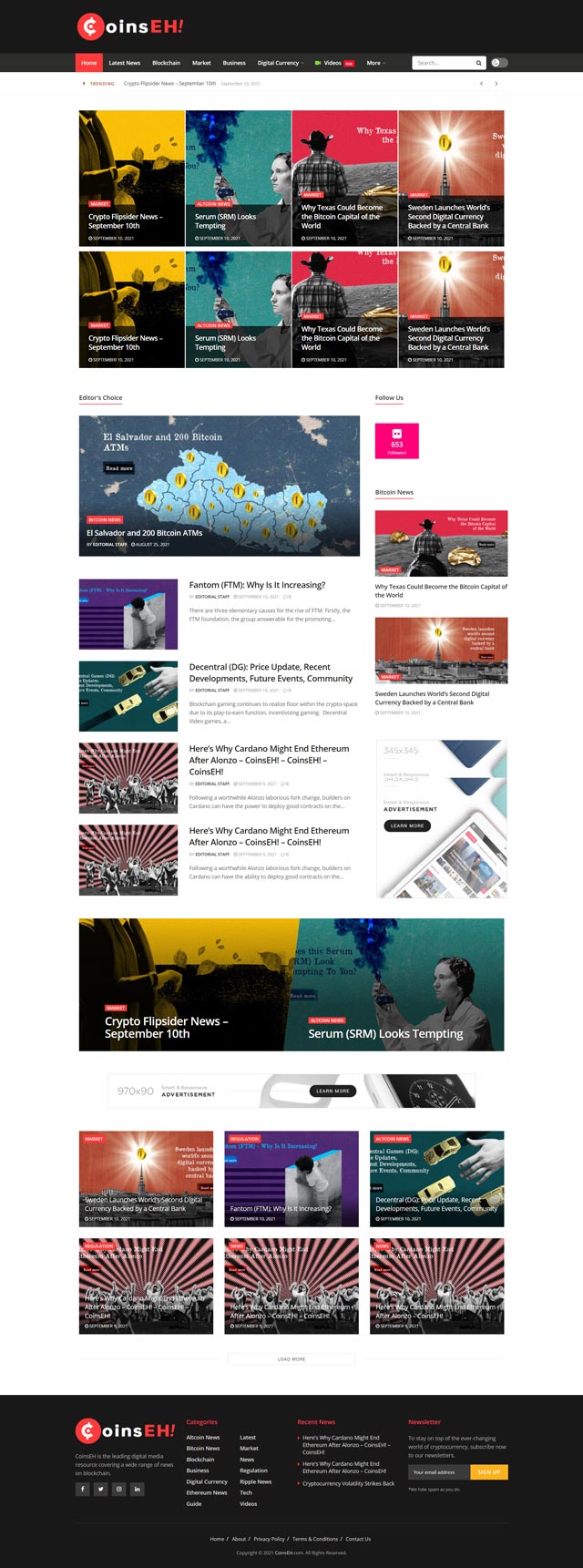
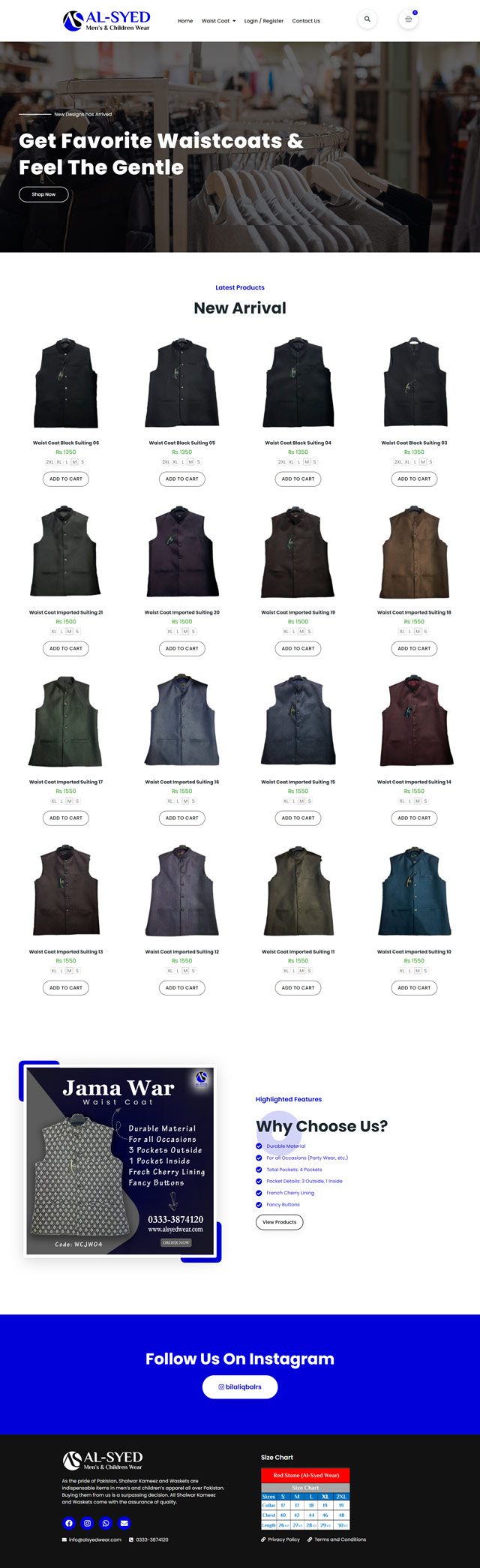
With more and more users accessing the internet from mobile devices, building a mobile-first website is essential for providing a positive user experience and increasing engagement. Here are some points to consider when building a mobile-first website.
- Prioritize Mobile: When designing and developing a mobile-first website, prioritize the mobile experience. This includes designing for smaller screen sizes, optimizing for touch-based navigation, and minimizing load times.
- Responsive Design: A responsive design allows a website to adapt to different screen sizes, providing a seamless experience for both mobile and desktop users. Use responsive design techniques like fluid grids, flexible images, and media queries to create a responsive website.
- Simplify Navigation: Mobile users typically have limited screen space, making navigation menus challenging to navigate. Simplify navigation by using drop-down menus, hamburger menus, or other techniques that prioritize ease of use.
- Speed: Speed is critical for mobile users, with studies showing that users will abandon a website that takes more than 3 seconds to load. Optimize website speed through techniques like image compression, minimizing HTTP requests, and using a content delivery network (CDN).
- Content: Mobile users tend to consume content differently than desktop users, with shorter attention spans and different browsing behaviors. Ensure that your website content is optimized for mobile users, with shorter paragraphs, bullet points, and clear headings.
- Test and Optimize: Regularly test your mobile-first website on different mobile devices to ensure that it provides a positive user experience. Use analytics to identify areas for improvement and continually optimize your website for better mobile performance.
Conclusion
In conclusion, building a mobile-first website is essential for providing a positive user experience and increasing engagement. By prioritizing mobile, using responsive design, simplifying navigation, optimizing speed, creating mobile-optimized content, and testing and optimizing, you can create a mobile-first website that drives results.


