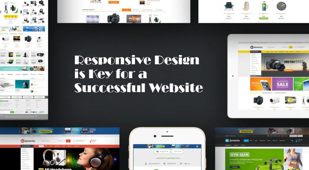
In today’s mobile-first world, having a responsive website design is more important than ever. With more and more people accessing the internet from their mobile devices, a website that is not optimized for mobile devices can result in a poor user experience and lost business. In this blog post, we’ll explore why responsive design is key for a successful website and how it can benefit your business.
What is Responsive Design?
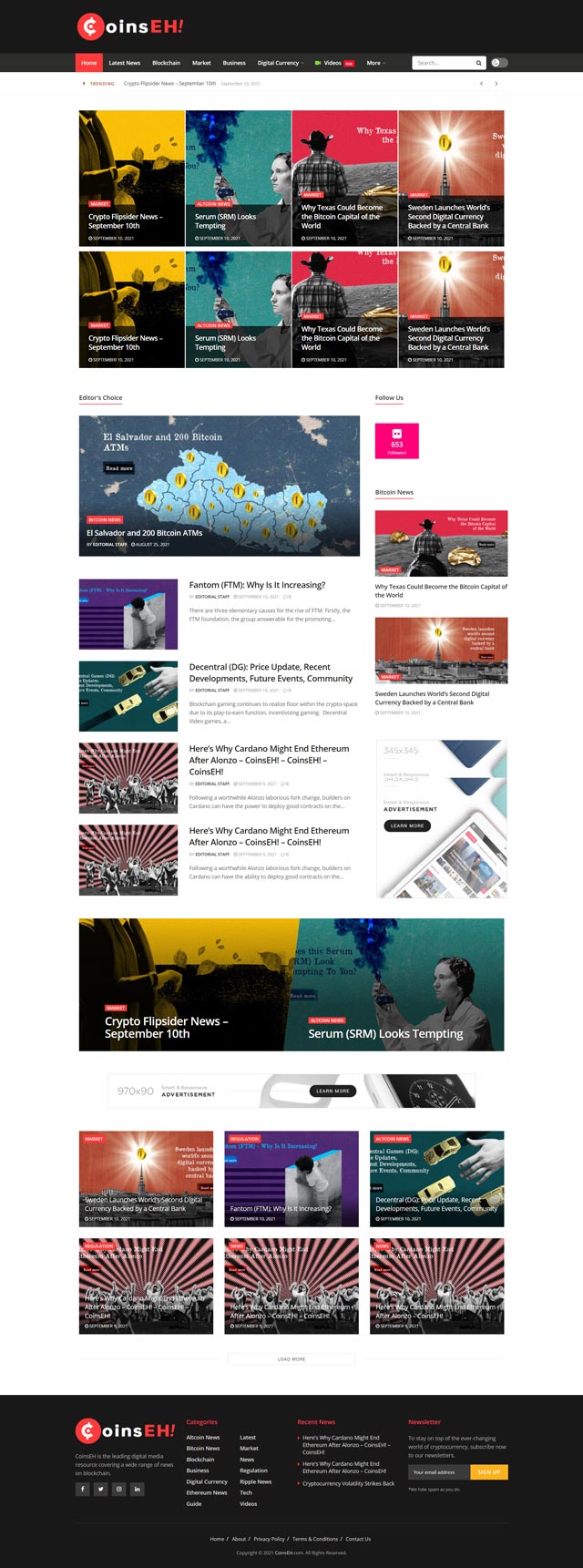
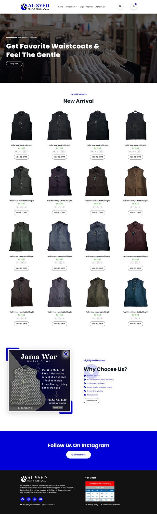
Responsive design is a web design approach that ensures a website’s content and layout adjusts to fit the screen size of the device being used to view it. Whether someone is accessing your website from a desktop computer, tablet, or smartphone, the website will adapt and display the content in a way that is optimized for the device.
Benefits of Responsive Design
- Improved User Experience
One of the biggest benefits of responsive design is improved user experience (UX). With a responsive website, users don’t need to zoom in or scroll horizontally to view content, which can be frustrating and time-consuming. Instead, the website adjusts to fit their screen size, making it easy to read and navigate.
- Increased Mobile Traffic
As mentioned earlier, more and more people are accessing the internet from their mobile devices. A responsive website can help you capture this traffic by providing a user-friendly experience on all devices. If your website is not optimized for mobile devices, you may be missing out on a significant portion of your potential audience.
- Better SEO
Responsive design can also improve your website’s search engine optimization (SEO). Google recommends using responsive design as it makes it easier for their algorithms to crawl and index your website. Additionally, a responsive website can reduce the risk of duplicate content issues that can arise from having multiple versions of your website for different devices.
- Cost Savings
Having a responsive website can also save you money in the long run. Rather than having to develop and maintain separate websites for desktop and mobile devices, a responsive website is designed to work across all devices. This can reduce development and maintenance costs over time.
How to Implement Responsive Design
If you’re ready to implement responsive design for your website, here are some tips to get started:
- Work with a Professional Web Design Company
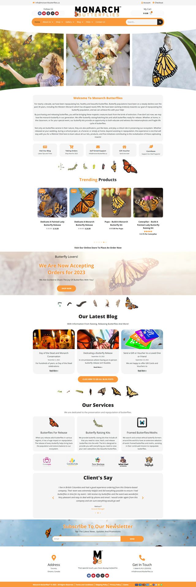
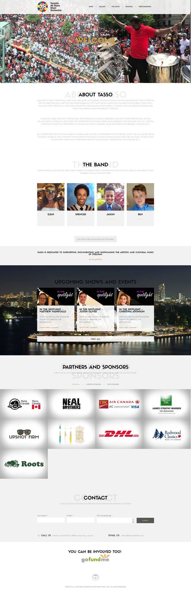
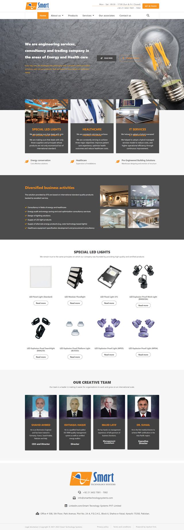
Responsive design requires specialized knowledge and expertise. Working with a professional web design company like Upshot Firm can help ensure that your website is designed to be responsive from the start.
- Use a Mobile-First Design Approach
When designing your website, consider using a mobile-first design approach. This means designing your website for mobile devices first, then scaling up to larger screens. This approach can help ensure that your website is optimized for mobile devices.
- Test and Optimize
Once your responsive website is live, it’s important to test and optimize it on different devices and browsers. Use analytics tools to track your website’s performance and make adjustments as needed.
Conclusion
In conclusion, responsive design is essential for a successful website in today’s mobile-first world. With improved user experience, increased mobile traffic, better SEO, and potential cost savings, responsive design is a smart investment for any business looking to succeed online. If you’re ready to implement responsive design for your website, work with a professional web design company like Upshot Firm to ensure your website is optimized for all devices.


